
Acetate eyewear colors fall into three core families. The Classics, like tortoiseshell, offer timeless commercial appeal. The Moderns, including translucent tints, communicate a minimalist aesthetic. Artisanal Patterns, such as marbled designs, provide a unique, high-end look. Strategic selection depends on your brand identity and target customer.
The 3 Core Acetate Color Palettes
As a designer, your first step is to understand the foundational language of acetate colors. Think of these as three distinct palettes, each with its own personality, manufacturing story, and strategic purpose. In my two decades, I’ve seen brands succeed by mastering these fundamentals. This knowledge is the difference between a random assortment and a cohesive, top-selling collection.
The Classics: Timeless & Commercial Foundations
This is the bedrock of any successful eyewear line. The classic palette includes colors with proven commercial viability for decades. They are your evergreen top-sellers, providing the stability and broad appeal every brand needs. These colors communicate a sense of quality, intelligence, and timeless style that resonates with a wide audience.
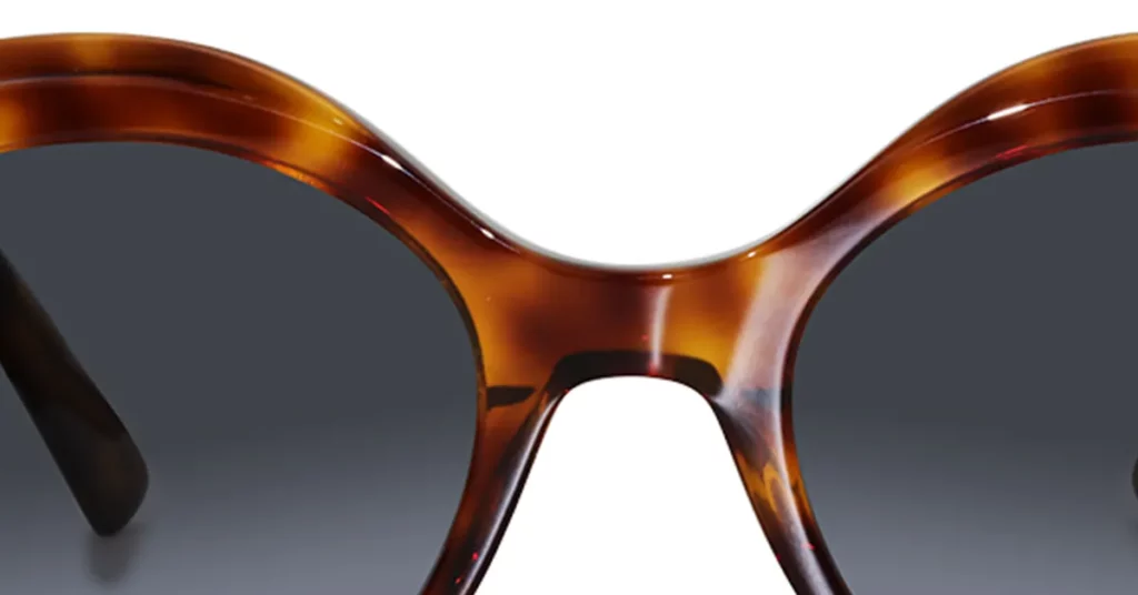
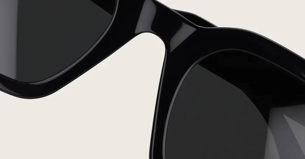
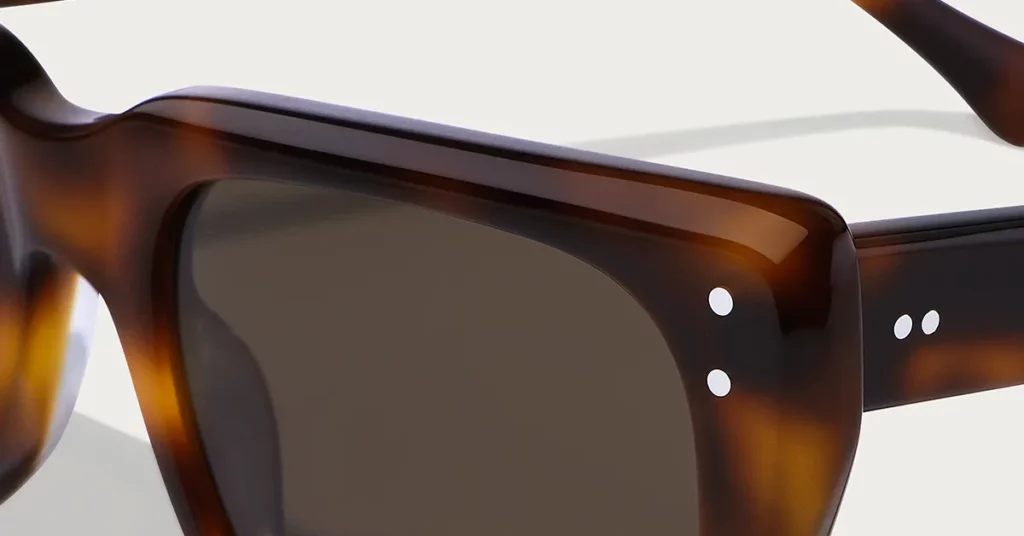
Fact: Havana & Tortoiseshell Are Kings of Classic Acetate
No pattern is more synonymous with acetate than tortoiseshell, also known as Havana. These patterns, with their swirling blend of ambers, browns, and blacks, are a timeless classic and the hallmark of premium frames. They are the reference point for heritage style and sophistication in the eyewear world.
- Strategic Insight: Conveys intellectual, luxury, and heritage brand values. When you choose tortoiseshell, you’re tapping into a rich visual history associated with intellectuals and old-world luxury. It tells your customer your brand values craftsmanship and a classic aesthetic.
- Manufacturing Note: Achieved by layering colors in block acetate. The beautiful depth of a true tortoiseshell pattern comes from this unique process. Individual colors are mixed, cast into a large block, cured, and then thinly sliced into sheets. This means the color is integral to the material.
Clarity Bridge: You need to understand that block acetate manufacturing is fundamentally about creating color depth that runs through the entire material. This means that instead of a surface-level pattern, layers of colored acetate are fused together into a solid block. Think of it like a layered cake; no matter where you slice it, you see the distinct, rich layers all the way through. This gives tortoiseshell its unmatched visual complexity.
Pro Tip: A non-negotiable, top-selling SKU for any foundational eyewear line. If you are launching a new brand, at least one tortoiseshell or Havana style is essential. It acts as a commercial anchor, consistently performing well across different demographics and style preferences.
The Moderns: Expressive & Trend-Driven Hues
The modern palette is where you can respond to current trends and connect with a more fashion-forward audience. These colors are often lighter, cleaner, and more expressive than the classics. They are perfect for brands that want to communicate a fresh, contemporary, and minimalist identity.
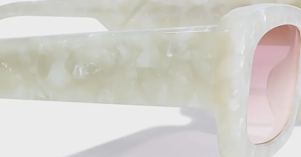
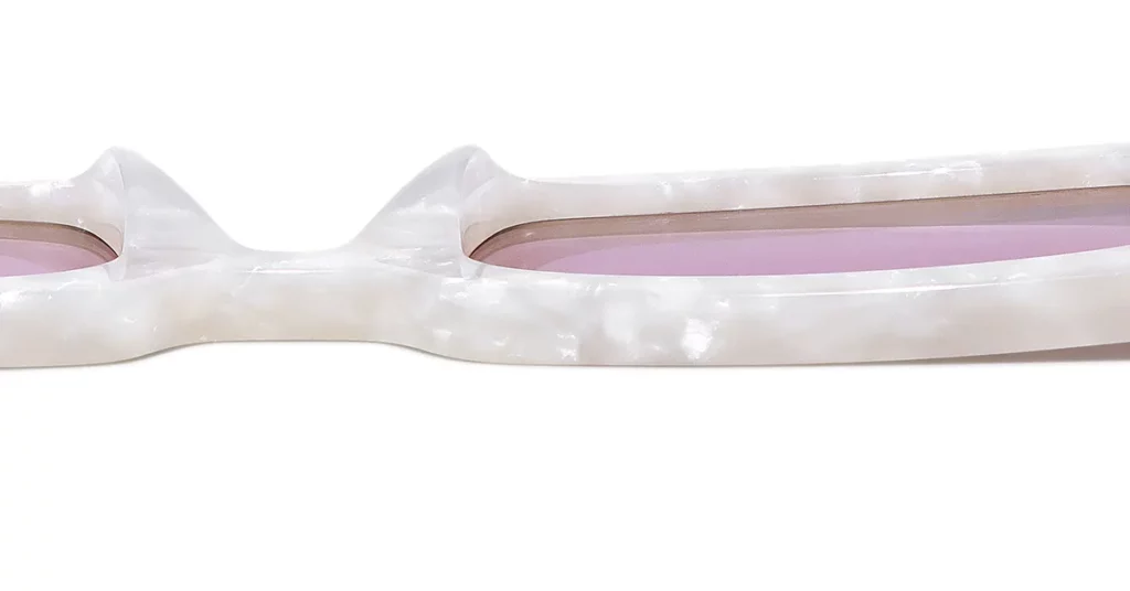
Fact: Crystal & Translucent Tints Are Trending
The modern palette is currently defined by transparency. From completely clear crystal frames to those with a delicate wash of color like champagne, blush, or ice blue, these styles offer a light and airy feel. They represent a departure from heavier, traditional looks and have become a staple for contemporary brands.
Strategic Insight: Communicates modernity, minimalism, and lightness; a key 2025 trend. Transparent and translucent frames are a cornerstone of minimalist aesthetics. They feel clean, unobtrusive, and technologically advanced, suggesting an effortless sense of style for your customers.
Pro Tip: Excellent for targeting younger, fashion-forward demographics who prefer subtle statements. Younger consumers, particularly Millennials and Gen Z, often gravitate towards these lighter styles, appreciating how they complement features without overpowering them.
Artisanal Patterns: Unique & High-End Designs
This family of colors is where true artistry and manufacturing prowess shine. Artisanal patterns move beyond simple solids and classics to offer something truly unique and eye-catching. These are the materials you use for your “hero” products—the ones that grab attention and showcase your design capabilities.
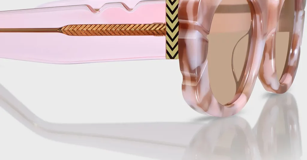
Fact: Marbled, Striated, and Abstract Lamination
Artisanal acetates feature complex patterns created by laminating different colors together. Marbled patterns offer a swirling mix of colors, adding artistry to your eyewear. Striated or layered designs create clean, graphic lines, while other abstract patterns can mimic natural textures or create bold visuals.
Strategic Insight: Creates a unique, high-end “one-of-a-kind” appeal. The unique patterns in this acetate mean no two pairs are exactly alike. This quality is a powerful selling point for customers seeking something special, elevating the frame from an accessory to a piece of wearable art.
Manufacturing Note: The pattern is a cross-section of a larger block, so no two frames are identical. Just like tortoiseshell, these patterns are created within a large block. Because each frame part is cut from a different part of the block, every single frame possesses a completely unique version of the pattern.
Clarity Bridge: The key takeaway is that an artisanal pattern is a unique snapshot of a larger, complex block of acetate. This means that the swirling colors you see on a frame are not a repeating print; they are a physical cross-section of a larger artistic composition. Think of it like slicing through a loaf of marble bread—each slice has the same ingredients, but the swirl pattern is completely different and unrepeatable.
Pro Tip: Use as a “hero” product in a collection to showcase design capabilities. An artisanal pattern is perfect for your showpiece. It draws attention to the collection, gets featured in photoshoots, and demonstrates your brand’s commitment to high-end design.
The Brand Archetype Matrix: A Strategic Guide
Now that you understand the core palettes, you must apply them strategically. A common mistake new brands make is choosing colors based on personal taste. The most successful brands choose colors that reinforce their core identity. We can simplify this by using four common brand archetypes. Find yours and use it as a filter for your color decisions.
The “Heritage Luxury” Archetype
This brand is built on timelessness, quality, and sophistication. It appeals to a customer who values craftsmanship and invests in products that last. The brand story is one of tradition and understated elegance, never chasing flashy trends.
- Core Palette: Deep Tortoiseshells, Solid Polished Black, Rich Demi/Ambers.
- Strategic Goal: To project timelessness, craftsmanship, and sophistication. Every color must reinforce that your products are an investment. These hues are serious, elegant, and communicate a deep sense of quality.
- Material Choice: Premium Italian (Mazzucchelli) block acetate is the benchmark. For this archetype, there is no substitute for the best. Sourcing from a world-renowned supplier is a critical part of your story and a proof point for your quality.
Common Mistake: Avoid using bright, trendy colors that dilute the brand’s heritage feel. Introducing a bright pink would be a critical error, creating a disconnect in your brand story and confusing the customer.
The “Minimalist Tech” Archetype
This brand is clean, modern, and forward-thinking. It appeals to a customer who appreciates precision, efficiency, and understated design. The aesthetic is inspired by modern architecture and technology, with a focus on clean lines and a “less is more” philosophy.
- Core Palette: Crystal Clear, Matte Black, Monochromatic Greys, Subtle Translucent Tints.
- Strategic Goal: To align with a clean, modern, and technologically advanced aesthetic. Your colors should feel chosen by an engineer or architect. The goal is to eliminate visual noise and focus on form and function.
- Material Choice: Often thinner, denser Japanese acetate that holds precise shapes. It is known for its strength and rigidity even in thin cross-sections, allowing for the precise, sharp lines essential to the minimalist look.
Pro Tip: Focus on the finish (matte vs. polished) as much as the color. For this archetype, texture is as important as hue. A matte finish can make a black frame feel more modern and tactical, while a high polish on crystal can make it almost disappear on the face.
The “Youthful Fashion” Archetype
This brand is bold, expressive, and fun. It targets a younger, trend-driven audience (like Gen Z) that uses fashion for self-expression. The brand is always on top of the latest trends and uses color to capture attention and create excitement. Consumer studies consistently show that Gen Z shoppers prioritize self-expression [McKinsey, 2023].
- Core Palette: Bold Opaque Solids (Reds, Blues), Playful Patterns, Two-Tone Color-Blocking.
- Strategic Goal: To capture attention and appeal to Gen Z’s desire for self-expression. These colors are designed to stand out, both in person and on a social media feed, giving customers the tools to express their personality.
Pro Tip: Use “hero” colors that are highly “Instagrammable” to drive social media engagement. When developing your collection, think about which colors will perform best on Instagram and TikTok. A bright, bold frame is far more likely to be shared and noticed.
The “Eco-Conscious” Archetype
This brand is built around sustainability, nature, and thoughtful consumption. It appeals to a customer who cares where their products come from and wants to support brands that align with their values. The aesthetic is natural, calm, and grounded.
- Core Palette: Earthy Tones (Khaki, Amber, Olive Green), Muted Pastels.
- Strategic Goal: To communicate a commitment to sustainability and natural materials. Acetate is plant-based, and your colors should reinforce this message. An earthy palette instantly communicates that your brand is thoughtful and connected to the natural world.
- Material Choice: Bio-acetate is the non-negotiable material for this archetype. It’s a more eco-friendly version made with a plasticizer of vegetable origin. It performs just like traditional acetate but allows you to authentically deliver on your brand’s promise.
2025 Color & Pattern Forecast for Eyewear
Understanding the archetypes gives you a strategic foundation. Now, let’s look at the specific trends shaping the market. For your 2025 collection, these three trends are the most important ones to watch. They represent a clear direction in consumer preference.
Trend #1: “Glass-Like” Translucents
This trend takes the idea of crystal acetate and elevates it with perfect clarity and subtle hints of color. It’s about making the material look as pure and lightweight as possible. The global market for stylish, premium materials like acetate continues to grow, projected to expand significantly by 2030 [Grand View Research, 2024].
- Description: Highly polished, crystal-clear frames or those with a subtle tint (e.g., seafoam, champagne). The key is the high-polish finish and the subtlety of the color.
- Why It’s Trending: Aligns with minimalist aesthetics and a desire for lightweight, unobtrusive eyewear. These frames complement your features without hiding them, offering a confident and modern way to wear glasses.
- Strategic Fit: Perfect for the “Minimalist Tech” archetype. A perfectly clear, highly polished crystal frame is the ultimate expression of this aesthetic—precise, clean, and technologically advanced.
Trend #2: Earthy, Muted Greens
Green is stepping into the spotlight as the new go-to neutral. Moving away from the long-dominant navy blue, these new greens are softer, more versatile, and bring a sense of calm and nature to an eyewear collection.
- Description: Olive, khaki, and deep forest greens are replacing navy as the go-to professional color. The trend is focused on sophisticated, muted shades that are surprisingly versatile.
- Why It’s Trending: Reflects a broader design movement towards natural, calming tones. Across design and fashion, consumers are craving warmth and tranquility. These earthy greens tap directly into that desire.
- Strategic Fit: Works well for “Eco-Conscious” and “Heritage” brand archetypes. An olive green directly reinforces a natural aesthetic, while a deep forest green has a classic, scholarly feel.
Trend #3: Bold, Retro-Inspired Pastels
After a long period of minimalism, we are seeing a joyful return to expressive and playful color. This trend is all about personality, nostalgia, and making a bold statement.
- Description: Opaque, 70s-inspired pastels like dusty rose, mint, and butter yellow. These are confident pastels with a distinct retro vibe that feel fun, optimistic, and full of personality.
- Why It’s Trending: A reaction to years of minimalism, signaling a return to playful expression. Designers and consumers are ready to embrace color and fun again, using accessories to express joy and individuality.
- Strategic Fit: The ideal choice for “Youthful Fashion” hero products. A pair of sunglasses in an opaque butter yellow is an instant “hero” product. It’s highly photogenic and allows your customers to make a unique style statement.
Manufacturing Insights & Quality Markers
To truly master color, you must understand the material. With acetate, the color and the material are one and the same. This fundamental concept is what separates premium acetate from cheap plastic, and it’s a story you should be telling your customers.
Why Acetate Isn’t Just “Plastic”
Many customers might see an acetate frame and think it’s just plastic. It’s your job to educate them. The richness and longevity of acetate’s color are a direct result of how it’s made.
Definition: In premium cellulose acetate, colored pigments are mixed into the raw material before it is formed into blocks and sheets. This means the colors and patterns are embedded throughout the entire material, unlike cheap plastics where color is simply sprayed onto the surface.
Simple Analogy: It’s the difference between solid marble and a painted countertop. With solid marble, the beautiful veins and colors run all the way through. If you chip it, you just see more marble. Acetate is like that solid marble.
- Key Benefit: This method prevents chipping, peeling, or fading over time. Because the color is part of the material’s core structure, it will remain vibrant for the entire life of the frames.
- Competitive Angle: This is the core quality differentiator from cheap, injection-molded frames. You can confidently tell customers your acetate frames offer superior color depth and longevity.
The Supplier Signal: Italian vs. Japanese Acetate
Not all acetate is created equal. Where it’s sourced from says a lot about its quality. The industry generally looks to two countries as the leaders: Italy and Japan.
| Feature | Italian Acetate (The Artist’s Choice) | Japanese Acetate (The Engineer’s Choice) |
| Best For | Complex patterns & rich color blends | Thin, precise & minimalist designs |
| Key Strength | Artistic expression, deep tortoiseshells | High density, strength & rigidity |
| Prime Example | Mazzucchelli | High-density acetate from Fukui |
| Archetype Fit | Heritage Luxury, Youthful Fashion | Minimalist Tech, Heritage Luxury |
The Bottom Line: Your choice depends on your design goals. If your brand relies on beautiful, complex patterns, Italian acetate is your best choice. If you need to create thin, strong, and precise minimalist frames, Japanese acetate is the superior option.
Pro Tip: Specifying the acetate source in your marketing is a powerful signal of premium quality. Mentioning “Mazzucchelli Italian Acetate” or “High-Density Japanese Acetate” in product descriptions is a simple, effective way to communicate craftsmanship.
A Procurement Expert’s Visual Inspection Checklist
When you receive samples, how can you tell if the quality is high? Train your eye to look for these four markers.
- Color Depth & Luster: High-quality acetate has a noticeable depth and a natural, rich gloss. It should not look flat or dull. Hold it up to the light to see the subtle layers and complexity within the color.
- Pattern Clarity: On a patterned acetate, look at the edges where colors meet. In high-quality material, these lines should be sharp and distinct. Muddy or blurred patterns are a sign of a lower-quality production process.
- Seamless Lamination: For frames with multiple layers, inspect the edges. You should see clean, seamless bonds between them. Any visible air bubbles or gaps are clear signs of poor quality control.
- Polishing Consistency: A premium frame should have a perfectly smooth and consistent polish. Run your fingers along the frame, paying attention to tricky spots around hinges or nose pads. Rough patches indicate a rushed job.

Common Color Strategy Pitfalls to Avoid
Over the years, I’ve seen brands make the same mistakes repeatedly when building their color strategy. Understanding these common pitfalls ahead of time will help you avoid costly errors.
Pitfall #1: Choosing a “Trendy” Color That Fights Your Brand DNA
This is the most common mistake. A new color trend emerges, and a brand rushes to incorporate it without asking if it fits their core identity. This can damage your brand’s credibility.
- The Problem: A heritage brand releasing a neon green frame that alienates its core audience. It feels jarring and inauthentic, sending a mixed message about who the brand is.
- The Solution: Always filter trends through your chosen Brand Archetype first. Ask: “Does this make sense for my brand?” A “Heritage Luxury” brand can interpret the green trend through a sophisticated forest green, not a neon one.
My Advice: “Let your brand’s story dictate your palette, not the other way around. A trend is a tactic, but your brand is forever.“
Pitfall #2: Creating a Collection Without a “Color Hierarchy”
Another common issue is a lack of strategic balance. A brand creates a collection where every frame is screaming for attention. This can be overwhelming for buyers and retailers.
- The Problem: A collection of 10 equally bold frames that compete with each other. When every piece is a “hero” piece, nothing stands out, creating visual noise and making the collection feel less premium.
- The Solution: Build your collection around 2-3 core classics, 1-2 modern/trend colors, and 1 artisanal “hero” piece. This structure provides commercial stability while still allowing for creativity.
My Advice: “Your goal is a cohesive family of products, not a crowd of strangers. Give each color a specific job to do.“
Pitfall #3: Underestimating the Impact of Finish
Many new designers focus 100% on color and forget the finish. But a high polish or a modern matte can dramatically alter a color’s personality and the frame’s perceived quality.
- The Problem: Choosing a beautiful color but opting for a poor-quality finish that makes it look cheap. A poor polish can undo all the great decisions you made earlier.
- The Solution: Understand that a matte vs. polished finish can completely change a color’s personality. A polished black acetate feels classic and formal, while the same black with a matte finish feels modern and tactical.
My Advice: “The color gets their attention, but the finish is what they feel. A premium finish communicates quality before they even try them on.“
Building Your Collection: A 3-Step Action Plan
Theory is important, but now it’s time for action. Let’s translate this into a simple, step-by-step process you can use to build your next collection’s color palette.
Step 1: Define Your Core & Accent Palettes
First, establish your color hierarchy. You need to create a balanced palette that serves different strategic needs, providing stability while allowing for fashion-forward excitement.
- Action: Select 2-3 “Core” colors from the Classics palette that will be your evergreen best-sellers. These are the anchors of your collection, like a classic tortoiseshell and a solid black.
- Action: Select 1-2 “Accent” colors based on the Forecast to create seasonal excitement. This could be an earthy green or a translucent rose that aligns with your brand archetype.
- Guideline: Follow the 80/20 rule—80% of your collection should be commercially safe, while 20% should be fashion-forward. This manages risk while ensuring you are both profitable and relevant.
Step 2: Map Your Palette to Your Frame Shapes
Not every color works on every frame. Next, strategically pair your color palette with the frame silhouettes in your collection. A thoughtful pairing elevates both the color and the shape.
- Action: Apply your Core colors to your most popular and timeless frame shapes. Think classic wayfarers, round P3 shapes, or elegant rectangular styles.
- Action: Use your Accent colors on more daring or trend-driven silhouettes. That oversized cat-eye is the perfect canvas for a bold retro pastel or a modern translucent tint.
For Example: A classic Tortoiseshell on a round P3 shape creates a timeless SKU. A Crystal Rose on an oversized cat-eye creates a fashion-forward statement piece.
Step 3: Develop Your Marketing Story
You’ve made strategic decisions about your colors. The final step is to communicate that strategy to your customers. Don’t just show them the color; tell them the “why” behind it.
- Action: For each color, write one sentence explaining the “why,” tying it back to your brand archetype. You need to arm your marketing team and retailers with the story behind each color.
- Story Example (Havana): “Our Havana Tortoise is a nod to the timeless style of academics and artists, crafted from authentic Italian acetate.” This connects the color to a lifestyle and reinforces its quality.
Conclusion
We’ve covered a complete framework for thinking about color, not as a decorative afterthought, but as a core strategic tool. From the three core palettes to the brand archetypes that guide your choices, you now have the knowledge to build a successful collection. Move beyond simply choosing colors you like, and start architecting palettes that perform. That is the path to creating a truly exceptional eyewear collection.
Frequently Asked Questions
1. What is the most popular acetate color for new eyewear brands?
For a new brand, the safest starting points are a classic tortoiseshell (Havana) and a solid polished black. These two SKUs provide a commercially reliable foundation that appeals to the broadest audience, allowing you to build brand recognition before experimenting with niche colors.
2. Does bio-acetate offer the same color richness as standard acetate?
Yes, absolutely. Modern bio-acetates offer the same depth, luster, and range of colors as traditional cellulose acetate. There is no aesthetic compromise, allowing brands focused on sustainability to tell a powerful eco-conscious story without sacrificing a premium look.
3. How much does premium Italian acetate add to a frame’s cost?
Sourcing from a supplier like Mazzucchelli can add several dollars to the raw material cost per frame compared to standard acetate. However, this is a strategic investment that unlocks a powerful marketing story, ensures superior quality, and justifies a higher retail price.
4. Why do some clear acetate frames turn yellow over time?
Yellowing in clear acetate is typically caused by a reaction to UV light and skin oils. This was a larger issue with older, lower-quality formulations. High-quality, modern acetate includes UV inhibitors and more stable plasticizers to resist yellowing and maintain clarity.
5. Can I request a custom acetate color from a manufacturer?
Yes, developing a custom acetate is a great way to create a unique product. Major producers offer custom development, but it requires a significant minimum order quantity (MOQ), often several hundred kilograms. It is a fantastic option for established brands.